RedFlash Group
The RedFlash Group felt like they were too close to their brand internally to look at it with a critical eye; they wanted an outside, unbiased approach to make their identity more contemporary and compelling.
Serving a variety of companies, associations, governmental agencies and non-profit entities in the public health and emergency response industries, they needed something that was bold and strong and would be representative of their strategic approach, yet was refined enough to retain the trust and confidence from their more traditional government clients.
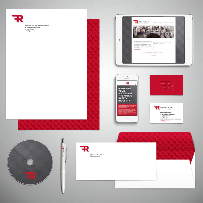
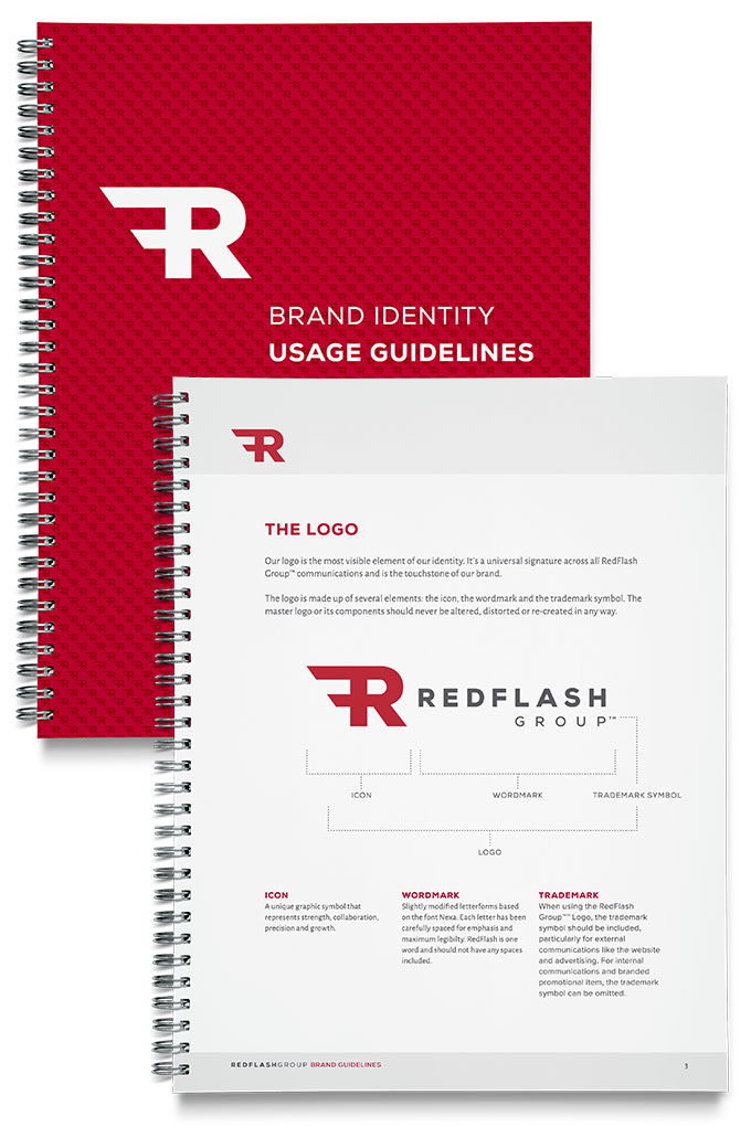
The result is a simple typographic blend of the letters R and F. It’s bold and eye-catching yet with it’s clean lines and precise corners, it remains traditional in nature.

