I say it often, but I think it bears repeating—your brand is more than just your logo or your website. Your brand is a culmination of those things, that together, create an experience for and an impression on your customers. And with that, it’s critically important that the impression you make is the same (or at least similar) in all places. In other words, make sure your package is tight!
Picture this:
You’re at the beach, the sun is shining and there’s not a cloud in the sky. A cool breeze blows through the air, the water laps at the shore and children happily play in the sand. You see a stunningly beautiful woman in a bikini, walking down the beach in your direction. Suddenly, time slows and it’s as if she’s moving in slow motion. She gently brushes her hair from her shoulders like she’s the star of a shampoo commercial and coyly smiles your direction (stay with me ladies, I know women look at other women).
As you drink in her beauty, your eyes begin to travel downward, from head to toe. Around her perfectly tanned, miniscule waistline, things take a turn for the worse and instantly you come to a screeching halt. Is she smuggling a monkey in her swimsuit?!? This woman’s bush has clearly gone rogue.
Your view of her is immediately and permanently altered, making her look, and you believe, that she’s far less appealing than you’d originally thought. Her brand is seriously out of alignment.
Ok, so perhaps this an extreme example, but a good one nonetheless. Now let’s take a look at one that’s a little more tangible.
I recently went on a lady date with a good friend. We had tickets to a show and headed out early to find a place to eat. Downtown San Diego is teeming with restaurants, bars and shops and constantly has new stuff popping up, so there’s no shortage of choices. Wanting to stay relatively close to the theater, we decided to wander and pick something that caught our eye.
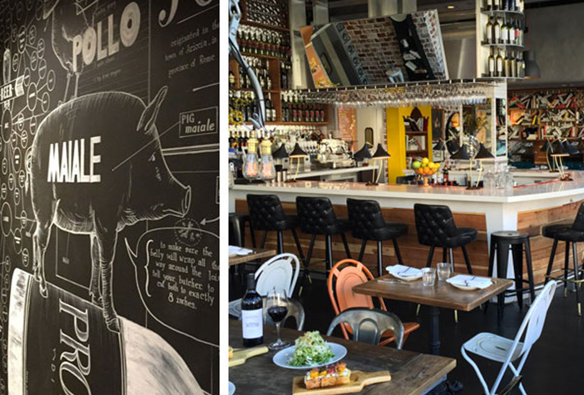
In the distance we spotted a corner restaurant with bright open spaces and funky decor and were instantly drawn in. Garage door style walls, bright-colored seating inside and out, and a huge hand-lettered name, painted vertically up the side of the building. Sold!
Arriving at Double Standard, we were politely greeted within seconds and offered our choice of seating. We sat inside, near the patio, to get the best of both the indoor and outdoor atmosphere. Before even picking up the menus that were placed on our table, we spent a good 10 minutes taking in all the decor, furniture and lighting, happily making us late for our show.
There was a wild eclectic mix of styles, colors, textures (and just plain stuff) all over the place. And while at first glance none of it fit together, it was clear that ALL of it fit together and that every detail of this place had been very carefully considered.
From the overstuffed bookshelf, with books placed in every position, to the historical art pieces in ornate frames with humorous mustaches and speech bubbles drawn on them, to the blend of sleek and textured materials in the stainless steel barstools and raw wood tables and walls. All my senses were on ecstatic overload.
And that was just what we could see from our table. The journey to the restroom revealed even more detail with a full-length hallway featuring floor to ceiling chalk art. There were recipes, infographics about beer, animals, and even an oversized scrabble game—all hand-drawn! To say we were impressed was an understatement. It was clear that a great deal of thought was put into creating a memorable experience to leave a lasting impression on their customers.

But here’s where the sad trombone starts to play and why it is critically important that all pieces of your brand package fit together.
When creating an experience for your customer, brand consistency is key in ensuring it’s the same experience regardless of where people interact with you, whether it be in person or online.
Completely enamored with Double Standard, I couldn’t wait to get home and look up their website so I could share it with all my friends and urge them to visit. My initial reaction upon doing so, however, was utter shock and awe. And not in a good way.
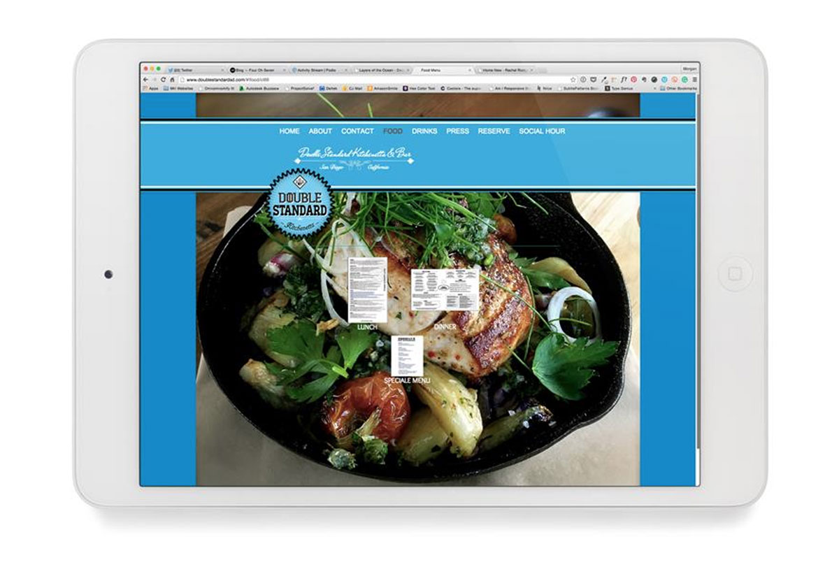
Arriving at their website, I was instantly confused and incredibly disappointed. I had to triple check their information and my search terms, convinced I’d clicked the wrong link. The site looked nothing like what I had experienced in person. NOTHING.

Here’s where Double Standard went wrong:
- Other than the name and some background images, nothing on the site matches the physical space. Not the colors, not the textures, not the fonts. Not even their logo. All visual representations of their brand are inconsistent and as a customer having seen them in person and online, I now question their credibility.
- The site is aesthetically jarring, an assault on the eyes. The contrast is too high between all the elements, and with text laid over busy images, it’s virtually impossible to read. As a user and potential visitor, I’m disinterested long before I even get to the restaurant.
- The menus are various pdfs, which is fine if the menu is seasonal and changes frequently, but nowhere is that indicated, making it feel like an afterthought. In addition, each of their menus has a different format as well as different fonts. Did different people create these or are they just lazy and/or forgetful about what they’ve already done?
- In addition to the stark contrast between the foreground and the background, the copy is different sizes on different pages. Again, where are the standards? Perhaps that’s where the name stems from?
- The press page is a hot mess. There is no rhyme or reason for any of the placement, they all link to external sites, driving traffic away from the business, and the video is set to autoplay, which is bad for accessibility, usability and general user sanity.
Double Standard has a serious problem with their brand consistency. The experience they’re creating for their customers is vastly different online from what it is in person. One is extremely positive. The other, quite the opposite.
So what does this mean for you, my friend?
Well, it means that if you are operating in more than one place, you need to get your affairs in order. It means that there is waaay more to business than just ‘having a website’. It means that your brand is the sum of its parts, not each one individually. It means, take this as a lesson of what not to do and make sure your carpet matches the drapes.
Having a fragmented brand changes the underlying perceived beliefs people have about your business, which can strongly affect their purchasing decisions. Had I seen Double Standard’s website before I’d been to their physical space, I would likely never have gone, and thus, they’d have lost a potential customer almost immediately. This experience, repeated hundreds of times, can mean a huge loss in revenue, which is not particularly good for business.
When is the last time you took inventory of all your brand outlets and assets? Are you in a similar position to Double Standard or know someone who is? My work wife and I have created a brand audit service to address this very problem (because it’s something we see A LOT).

Depending on your exact struggles, there’s likely a number of different issues affecting your lack of sales, customer, and visitors. A brand site audit can help you improve your design, branding + strategy. In it, we’ll review your site design, brand message, site structure + overall user experience to identify areas requiring TLC as well as opportunities to help you better align with your goals and audience.
Build it and they will come only worked for Kevin Costner. And that wasn’t real life. We’ve seen the internet and know there are lots of organizations out there who could benefit from a brand site audit (maybe even you?). If you or someone you know is suffering from overwhelming website shame, send them our way. We’ll get them tipping the happiness scales in no time!