Raindrops on Roses
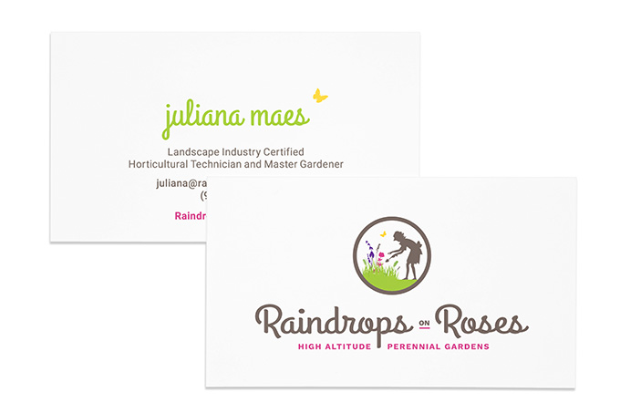
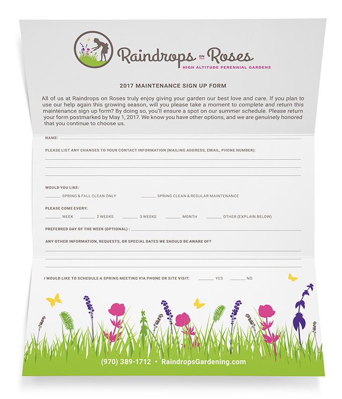
Often times, we’re too close to our own stuff to really be objective about it. Such was the case with Raindrops on Roses, who provides landscaping services to create and maintain high altitude perennial gardens. A micro-sized business that operates mainly in person, owner Juliana Maes wanted to create more impact with her business cards and annual letter — which was the only piece of printed marketing collateral the company uses.
As a branding specialist, my immediate attention went to her existing logo. It was incredibly busy, difficult to read, and had some weirdly disconnected details in the type. As we got to talking, Juliana admitted that she didn’t love it and sort of ended up there after an exasperated previous experience. We discussed what she liked and didn’t about the mark and how I thought we could improve upon it, which was the spark for the design direction as a whole.
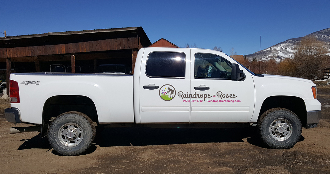
Lush perennial gardens, with vibrant, bold colors, are not the immediate picture that comes to mind when you think of high altitude locations. But that’s exactly what Raindrops on Roses specializes in creating, so the color palette shifted from dark and dreary to vivid and bright, reflecting a more accurate picture of what the company provides. The culture of the company and its staff is energetic and joyful, which is also more accurately reflected in the type and layout. The identity was also used to create some vehicle graphics to act as a passive marketing tool for the business while the staff are out on job sites.