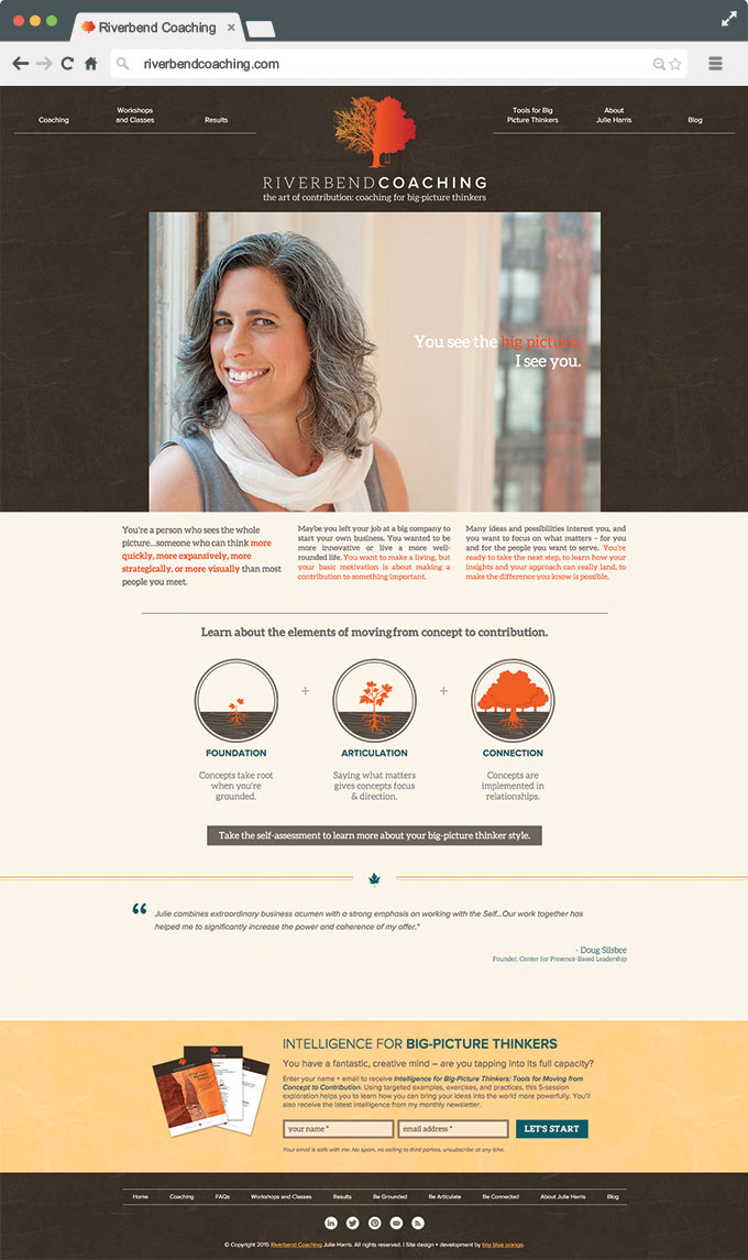
Riverbend Coaching
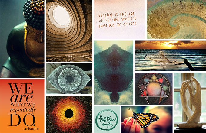
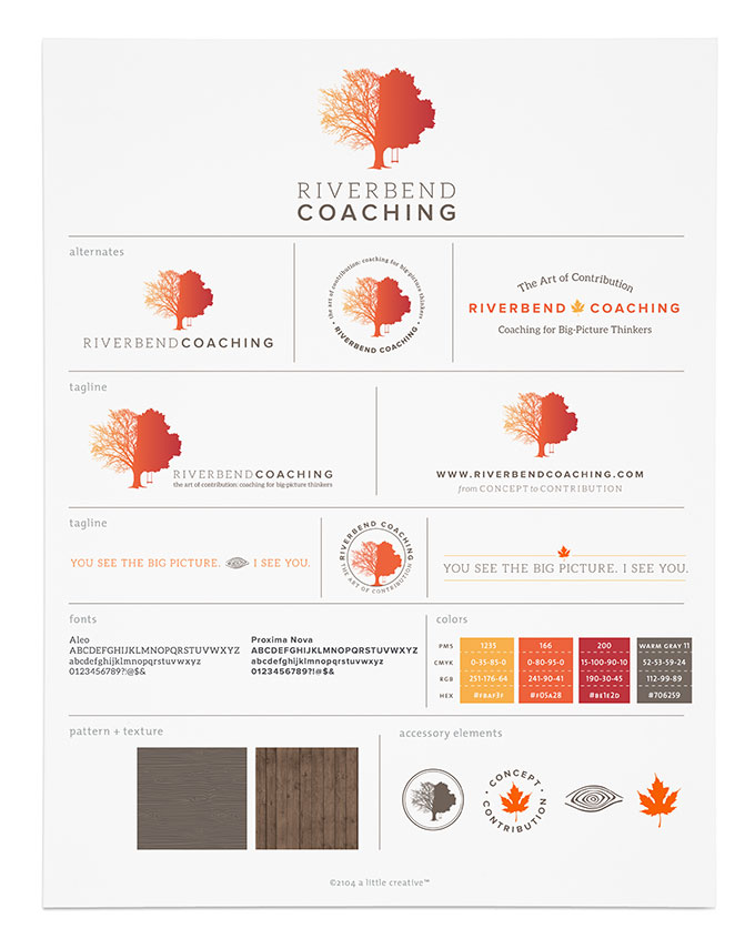
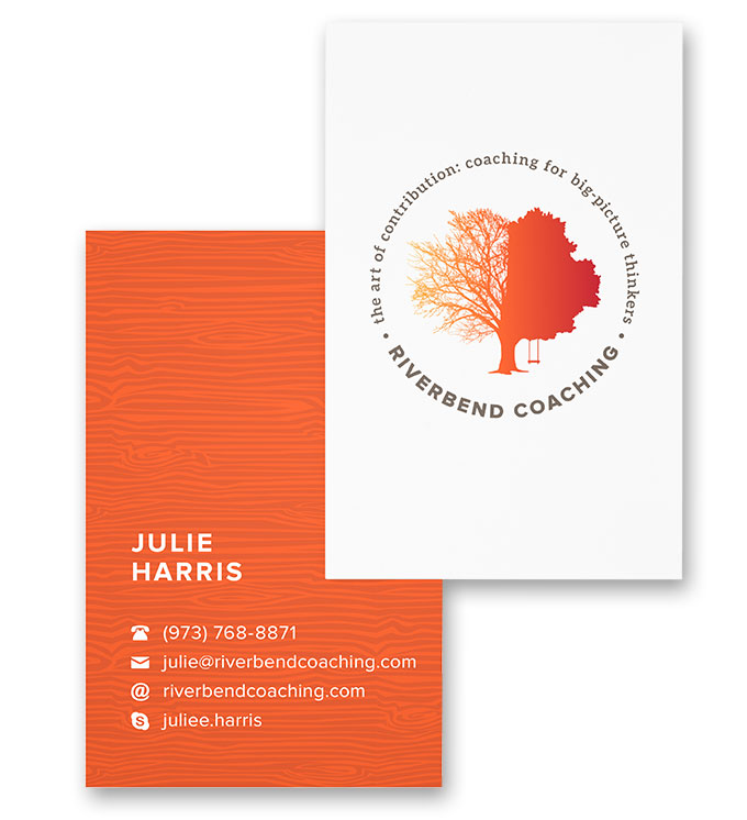
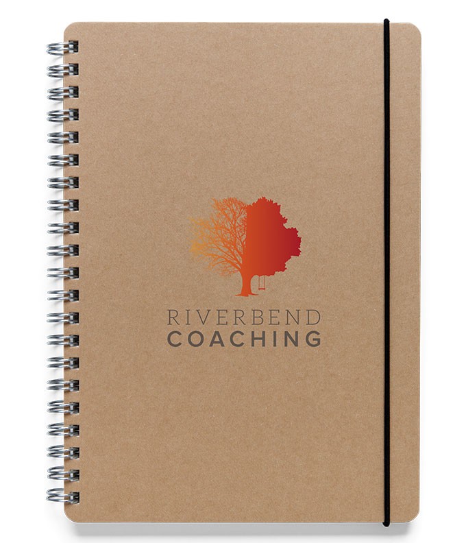
Every logo tells a story and such is definitely the case with the new identity for Julie Harris, the coach and consultant behind Riverbend Coaching. Helping high level executives and big picture thinkers bring their ideas from concept to contribution, Julie was seeking something that would represent the depth of the connection she makes with people through her practice and evoke feelings of calm stillness and security.
A common thread among Julie’s clients is the desire to slow down and live a rich life not only in work, but outside of it as well. The new logo is an oak tree, a hardy breed, symbolic of strength, great wisdom and longevity. It’s shown in transition, much like Julie’s clients, going from compartmentalized, fragmented and scattered, to lush and full.
With an added rope swing detail, the tree evokes feelings of nostalgia and ideas of a forgotten childhood. Telling stories once remembered, sharing stories, knowledge, and experience with others. The overall idea is one of building on your foundation and using it to be fully engaged and look at things holistically. A simple shape, but one that represents an immense amount of depth and complexity.
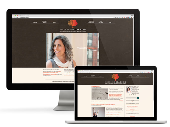
The website redesign was headed up by Tiny Blue Orange, with a little help from me.
Need some help bringing your brand to life? Let’s connect!
website design lead and development by Tiny Blue Orange